Your website is the single most important part of your sales funnel. It’s not an easy task to make high converting landing page. A lot of the time you may be getting a lot of traffic, but are you converting those visitors to leads?
If your conversion rate is on the low side, don’t start by changing all at once. First, identify specific factors that may impact the conversion rate and start changing them properly.
It’s not just about great content and design, many UX/UI factors impact your conversion rate.
So, if you’re interested in discovering what these are and how to convert more users on your site, keep reading.
High Converting Landing Page
A high-converting landing page is a web page designed and optimized to effectively persuade visitors to take a specific action, such as making a purchase, signing up for a newsletter, or filling out a contact form.
It typically achieves a high conversion rate, meaning a significant percentage of visitors complete the desired action. To create a high-converting landing page, you should focus on elements like compelling headlines, persuasive copy, clear calls to action, user-friendly design, and trust-building elements such as testimonials or trust badges.
When we talk about landing pages in eCommerce, we can say that a high-converting landing page for e-commerce is a web page within an online store that is specifically designed to drive sales and encourage visitors to make a purchase.
The secret is that a simpler landing page, good site speed, and clear call-to-action can increase conversions on your landing page.
Simpler your Landing Page
Landing pages are one of the very first touch points you have with your potential customers. Your home page is where the journey begins. It should feature your brand and tell a story that builds trust and credibility.
Bold, catchy, and short headlines are always recommended.
For example, a good strategy would be to have a headline that explains the main benefit of your product or service.
You could also use trigger words such as why or how – “How to increase sales with ”. It’s all about grabbing the users’ attention, and letting them know just how special your product or service is.
Value of the product
Once you have their attention, it’s time to explain the value and benefits of your product.
Users are always more interested in hearing solutions to their problems. So rather than only outlining the features of your product, try explaining the main benefits – how are these features going to help them?
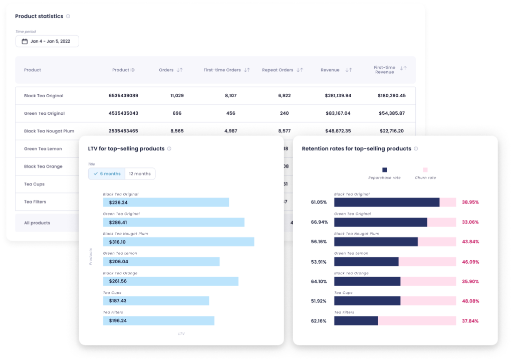
A smart approach to improve your landing page’s performance is to identify which products your customers purchase regularly.
By checking the products that bring you the most loyal customers over time, you’ll also learn that this type of landing page appeals to your customers.
Another great tactic is showing social proof. This is one of the best ways to reassure your customers or visitors about your product. Gather up your best user reviews or press coverages and feature them on your landing page.
You could also feature your customer success stories, just like we did in the example below.
Site Speed
You may not think about it, but your website speed can actually have a huge impact on your conversion rate. Site visitors are not patient and forgiving, so every second makes a huge impact on the bounce rate.
In 2012, Amazon calculated that a website load slowdown of just one second would cause a $1.6 billion loss in annual revenue. It’s crazy how even one second may impact your results, right?
Another reason why your website should be lightning-fast is because of people who shop on their mobile phones. According to Statista, half of all internet traffic is done on a mobile device, so it is crucial to make sure your website is mobile-friendly and super-fast.
Before, you could check your site speed on Google Analytics. But, with the new Analytics 4, there is no such option.
However, you can check your speed and insights with PageSped Insights.
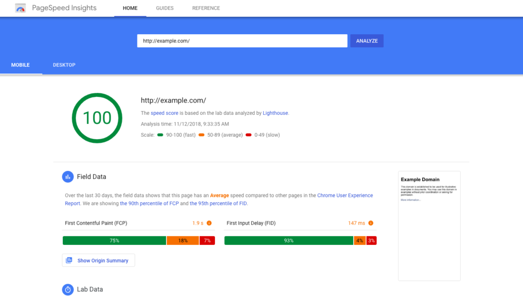
According to Google, as your website page load time goes from 1 second to 10 seconds, the probability of bounce increases by 123%. So in this case, you’ve not only killed the conversions, but you’ve also created a frustrating user experience.
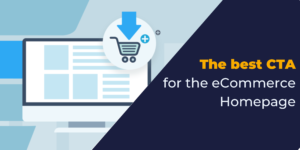
A Clear Call To Action (CTA)
The third thing you need to keep an eye on is the call-to-action placement. You’ve probably heard of the terms above and below the fold, but here’s a short explanation, just in case.
Above the fold is the portion of the website that you immediately see without scrolling or taking any other action. Below the fold refers to all the content that you see when scrolling down a website.
Paying attention to the fold is crucial because you want to create a great user experience. The key thing is to identify the best places to put your call to actions, images, copy, etc.
So if your content is above the fold and is getting a lot of traffic, great job! But if there’s no call to action for users to take, they are simply not going to convert.
Similarly, if too many options are presented or all your CTA’s are placed below the fold, people are barely gonna view it and therefore, they’re going to bounce out. So always remember to keep your CTA’s easy to spot and use.
What should you really do?
You want your users to explore the whole website so balance is key. A good practice is to put your high-priority content above the fold. This could be an intro about your business along with some important brand imagery.
We also recommend having at least one visible call to action above the fold so your users have a clear idea of where to navigate next.
If you’re curious to see how visitors interact and engage with your site, Hotjar is a great tool for it. The heatmaps show your visitors clicks, taps and scrolling behavior, while recordings help you see how they navigate through certain pages.
This is one of the easiest ways to find critical pages of your site and improve user experience.
Conclusion: High Converting Landing Page
Converting your visitors into leads isn’t as easy as it seems, but once you start analyzing more, the results will come. Remember, there are many ways to improve your conversion rate, these are just some of the starting points which will help you get an idea of it.
And if you’re interested in learning more about landing page design, we suggest reading this article from Toptal, which provides a comprehensive guide to creating effective landing pages. Start by implementing some of these tips and eventually you’ll see the difference.
We are always down for any potential discussion points that might help you or your business, so feel free to drop us a line at [email protected]
⭐⭐⭐⭐⭐
100+ five-star reviews on Shopify App Store

No comment yet, add your voice below!